New Look and Feel for Fitli
Tonight is the night. We are super excited to launch an enhanced look and feel for the Fitli web application.
Something for Everybody
Week in and week out, we get feedback from you, our customers, about how we can make Fitli better. We get feedback from business owners. We get feedback from Trainers and Instructors. We also get feedback from Clients and Consumers. All that feedback is recorded, accumulated, reviewed, assessed, and used to determine what to work on next. Often it’s a new feature or an enhancement to an existing feature. Sometimes it’s a bug. One consistent theme of feedback we get is on the ‘look and feel’ (aka experience or usability). Some things are good, but others not so good. We have always agreed, but it can be a big undertaking to change these things.
Finally, we have done it. It’s not the end all, be all. It’s not perfection… but it’s a step in the right direction… a big step.
See a breakdown of the various changes below.
Please enjoy and, as always, let us know what you think.
Mobile Enhancements for Clients and Consumers
Since we launched Fitli, there has been a gap on the mobile side for clients because we don’t yet have an Android App. We know this is a problem and we have plans to build out a Fitli Android App in 2018. The problem has been exacerbated by the fact that booking and purchasing for clients on their phone using Fitli via a browser is note a great experience. It’s doable, but confusing and frustrating at times.
So, one of the biggest goals of this effort is to significantly improve the experience of using Fitli in a browser on a mobile phone. As mentioned above, it’s not perfect, but we believe it is MUCH better. You can decide for yourself by giving it a try.
For those of you who want a quick summary of the changes, here you go:
- Simpler and cleaner navigation
- Clean white background
- Removal of extraneous images and content
- Changing tables from horizontal to vertical to avoid the sideways scroll
For those of you who can’t wait to see what’s coming, here are a few “old” and “new” comparisons for you to see what we have changed.
Right off the bat, you can see some pretty obvious differences.
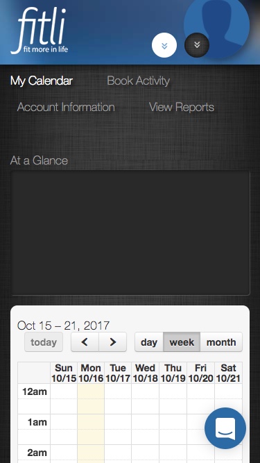
- On the left, you have the current version. There are so many things wrong here, I’m not sure where to start.
- The most obvious is the navigation links.
- Then you have the large empty space for ‘At a Glance’ that occurs when you don’t have anything booked.
- Of course, it’s also odd to have the two drop downs at the top of the screen.
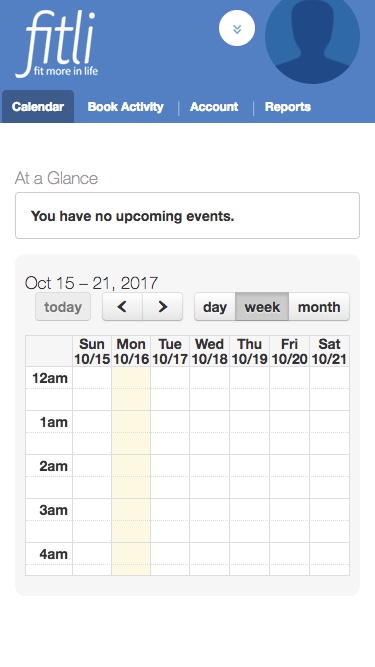
- All of this is resolved in the new version on the right. We hope you agree the navigation is much cleaner and we’ve killed the big empty space.
CALENDAR – OLD
CALENDAR – NEW
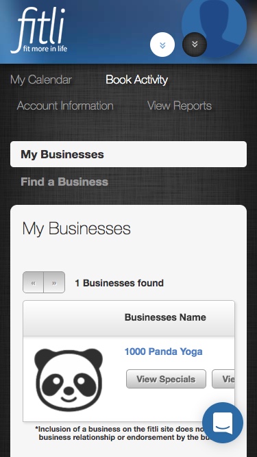
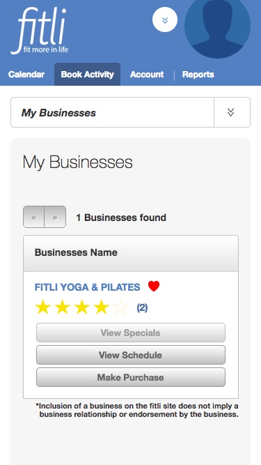
On the next set of screens, we have clicked on ‘Book Activity’. You have a choice of ‘My Businesses’ or ‘Find a Business’. As always, if you have a favorite business, they are already in your ‘My Business’ tab and that is the default.
- The first change here has to do with the sub-navigation items. Instead of listing out the two options to be clicked on, we have saved some space and moved these sub-navigation items into a drop down selector.
- The other change is a huge one and you will see this throughout the new design. We have changed all the horizontal tables to be vertical. No more scrolling to the side to see the content or find a button to tap. This should make booking and buying 100% easier. Tap away!
- The logo is no longer shown for the list of businesses due to space limitations, but we are looking at ways to bring it back in.
BOOK ACTIVITY (My Businesses) – OLD
BOOK ACTIVITY (My Businesses) – NEW
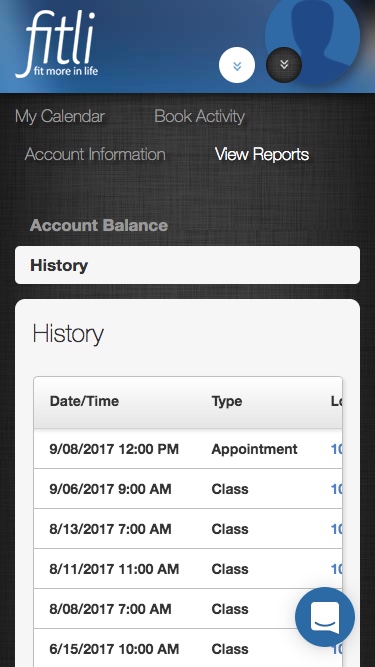
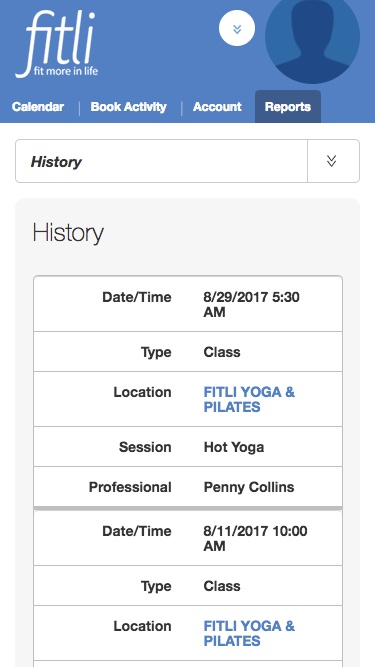
One more example of the impact of changing the tables from horizontal to vertical.
- In the old version on the left, you can see there is transaction history, but you can’t read all the data and must scroll to the right to view it. Yuk!
- In the new version, you can see all the data on the page and scroll through fast or slow.
VIEW REPORTS – OLD
VIEW REPORTS – NEW
Lastly, and most importantly, here is a comparison of the overall experience to find your business, click in and view the schedule, then book and pay for a session. We thought a video would be the best way to demonstrate this.
- The first video on shows the current process. One thing to note is that it takes 1:18 seconds to get through the process on the old design. You can also see some areas where you’d expect it to scroll and it doesn’t.
- The second video shows the new process. This process takes only 54 seconds to get through from beginning to end. It’s 23 seconds shorter than the old process. That is a 30% time savings.
BOOK AND PAY – OLD
BOOK AND PAY – NEW
Mobile Enhancements for Business
Many of the changes shown above will translate into a better experience for business users as well. However, there is still a good bit of room for improvement. As you can imagine, the business functionality is much more extensive and, thus, harder to simplify and fit on a phone sized screen.
- So, while the navigation is better, it doesn’t quite work perfectly yet. This is something we will be looking at in future releases. Don’t get me wrong, it’s still significantly better, but we know we have work to do.
- Tables are now vertical vs. horizontal so no side scrolling. That itself is a huge win.
- Whereas some things were very difficult if not impossible to do on a phone before (mostly because of side scrolling and extraneous info), you should now be able to use any page on the business application.
- All the things that you should be able to do much more easily on your phone include:
- Scheduling or canceling a class
- Scheduling or canceling an appointment
- Checking status of upcoming classes, checking clients in, sending messages
- Reviewing customer profiles and initiating purchases of booking on their behalf
- Viewing reports
- Creating and editing products, packages, and promotions
- Yeah, pretty much everything will be easier to do with the improvements
Usability on a computer or tablet is better too
While there was a big focus was to improve usability on phone sized devices, many of the changes are going to be immediately visible to you when you log in on a computer or tablet.
- Just from a pure look and feel perspective, it’s been modernized a bit. We’ve discarded the dark brown background for a clean white. That will make it easier to make Fitli look better on your embedded calendar pages. If you have done anything specific to match the brown background, you should take a look once it’s live to see if you might want to alter anything.
- The Navigation is much cleaner. Just note that the main navigation items are now part of the dropdown in the top left. This will be particularly important for those of you with multiple locations/businesses. You can see which business you are in by looking at the logo and business name on the top left, but to change, you will now need to select the dropdown on the top right.
We are here to help
If you have any questions, you can take a look at the FAQ.
If you can’t find what you’re looking for, feel free to email us at support@fitli.com or chat with us on the www.fitli.com website.
